DISCOVERY AND BRAND VISION
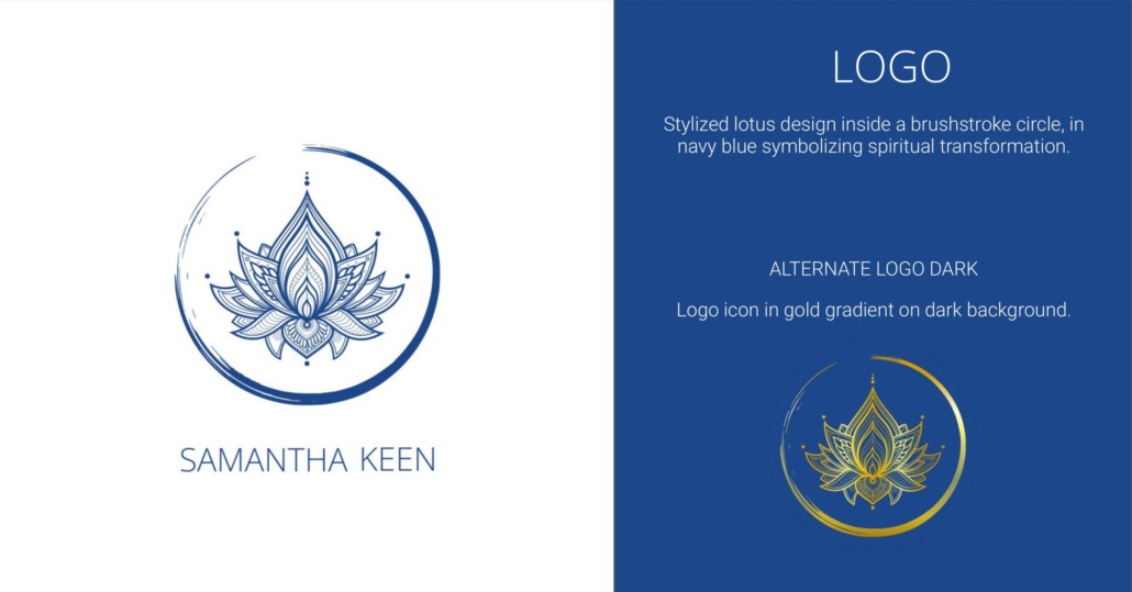
Through a series of deep-dive sessions, we explored the heart of what Samantha wanted her book—and brand—to communicate. We experimented with different visual directions, until one symbol rose unmistakably to the surface: the lotus flower. A timeless emblem of growth, transformation, and emergence, the lotus became the design’s centerpiece. It shaped the book cover, inspired the new logo, and informed the visual rhythm of her entire site.
A SHIFT IN FOCUS
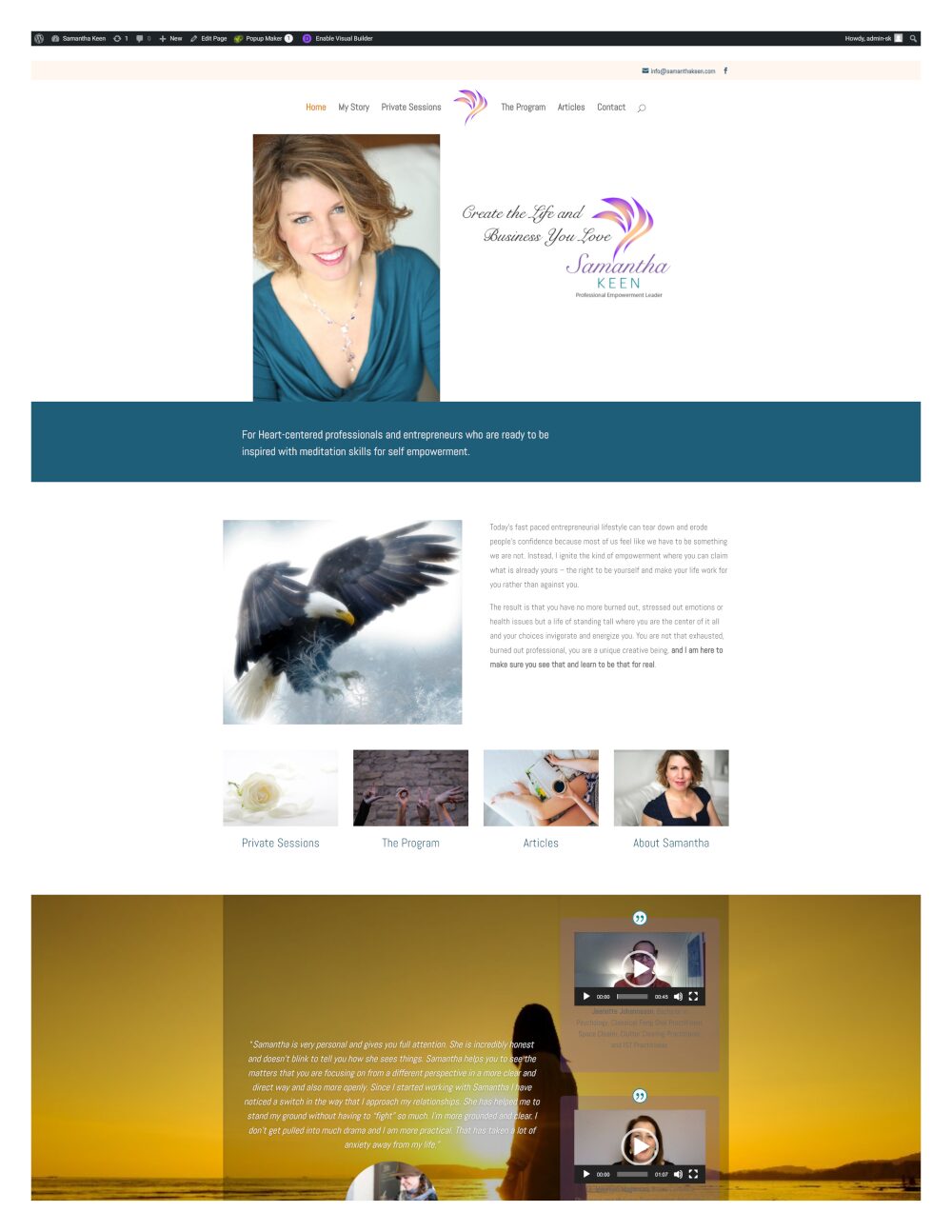
As the work unfolded, Samantha’s clarity about her evolving audience grew. What began as a brand that had largely spoken to women was now being re-imagined to resonate with a broader, more inclusive group. We developed a new style guide to reflect this shift—finding a visual balance that felt expansive without losing warmth or intention.
The process also brought forward an exciting new direction in her work: the integration of spiritual insight with modern technology. This future-forward theme became a quiet but powerful thread in the refreshed design—a nod to where her brand is headed, not just where it’s been.
EXPANDING THE PROJECT – A WEBSITE EVOLUTION
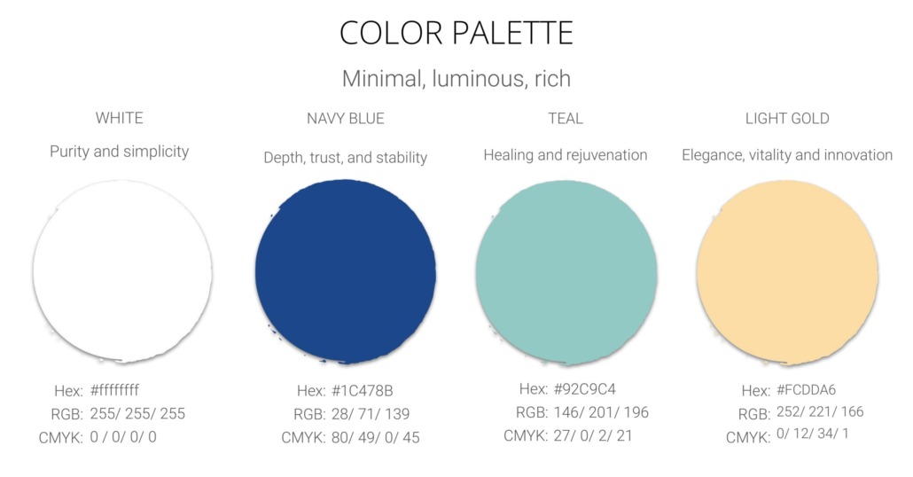
We curated custom banner imagery and a visual palette that aligned with both her book launch and her bigger-picture goals. Initially, these were meant for her publisher’s team to use—but once Samantha saw how cohesive the design was becoming, she invited us to take over the full website redesign.
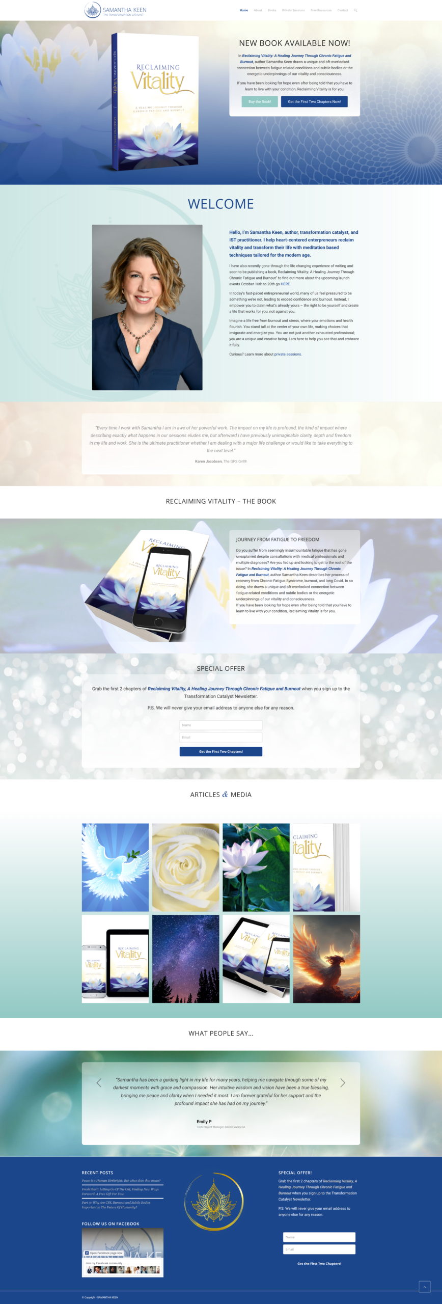
Using the Enfold theme, we built a site that was intuitive, polished, and beautifully aligned with her new identity. It included a fresh lead magnet to capture newsletter sign-ups and gently guide visitors toward deeper engagement.
RESULTS & IMPACT
The results were immediate and encouraging. Within ten minutes of sending out her first newsletter, four new subscribers joined her list. Within two days, that number had doubled. The brand was clearly resonating—and not just visually, but emotionally and energetically.
By the end of our work together, Samantha had more than just a beautiful book cover and a polished website. She had a cohesive, future-facing brand identity—one that honored her roots while creating space for evolution.
“Everyone who looks at my website, my book, my social media promotion—are all blown away. Even people who have worked in book promotion for a long time. I think my favorite thing about Yohanna’s work, although there are many things I love, is her incredible artwork. It’s truly of the highest standard.”
~S.K., Berkeley, CA
Visit her online at samanthakeen.com.
Have a vision that’s ready to grow? Let’s bring it to life—visually, strategically, and soulfully. Reach out at info@archetypeand8.com or click below to use the inquiry form to schedule a complimentary call.


 © Yohanna Jessup - Archetype & Hourglass