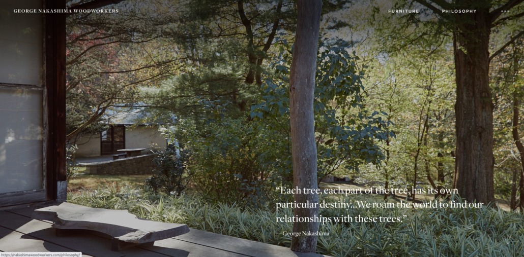
The philosophy page of George Nakashima Woodworkers. A beautiful immersive web experience that integrates beauty and function.
BEAUTY WITH PURPOSE: RETHINKING THE ROLE OF BEAUTY IN DESIGN
Beauty in Web Design: Why Aesthetic UX Is More Than Just Looks
There’s a growing mantra whispered across design circles: “Pretty websites suck.” It’s blunt, provocative—and misleading. The argument suggests that aesthetics distract from function, that a site exists solely to perform, not to inspire.
But this is a false dilemma. Great design doesn’t choose between form and function. It harmonizes them.
The Simplified Argument: Function Above All
Proponents of the “function first” mindset make a rational case. They value clarity, speed, accessibility. They see websites as vehicles for action—buy, book, learn, move. From this view:
- Overly stylized interfaces risk becoming sluggish or disorienting.
- Users care more about seamless journeys than color palettes or animations.
- Minimalism feels lean, direct, conversion-optimized.
This thinking, common among developers and data specialists, is valid—but incomplete.

The Taj Mahal, and example of beauty and functionality in architecture.
The False Binary of Form vs. Function
We would never ask an architect to choose between structural soundness and beauty. The finest spaces do both. Digital design deserves the same standard.
True design craft doesn’t dilute elegance for clarity. It integrates the two. How something looks and how it works are often inseparable.
Why Beauty Matters—Functionally
The data speaks:
- People form first impressions in 50 milliseconds, based almost entirely on visual input.¹
- Stanford found that 75% of users judge credibility based on a site’s design.²
- Aesthetic interfaces increase satisfaction—even when usability remains constant³ (Tractinsky et al., 2000).
Visual design communicates trust, tone, and care—before a single word is read.

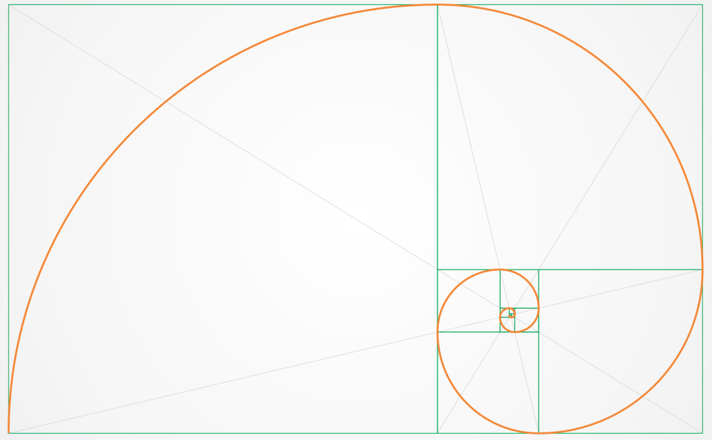
The golden spiral.
Beauty as Cognitive Ease
Elegant design soothes the mind. Spacing, rhythm, restraint—they quiet cognitive noise. Users navigate more effortlessly. Decisions feel simpler. Friction fades.
Designers have long turned to principles like the golden ratio to bring natural balance and visual ease to their work.
We underestimate how much design affects mental load. A harmonious layout—balanced typography, consistent spacing, thoughtful color—doesn’t just “look nice.” It helps the brain process faster.
This ease paves the way for flow—that elusive, focused state every UX designer aims to cultivate.
This isn’t indulgence. It’s performance.

The one page site of artist and designer Sonja van Duelmen is an example of playful mixed layouts that don’t disorient the user .
Aesthetic Resonance = Emotional Connection
For purpose-driven brands, wellness platforms, or creative studios, aesthetic alignment is more than decoration. It’s translation.
Design becomes a visual language for intention. A site doesn’t just say who you are. It feels like you.
And that feeling endures.

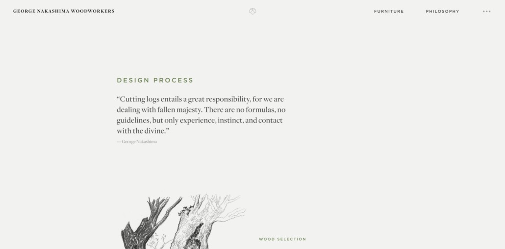
The design process page of George Nakashima Woodworkers. Beauty in web design that elevates experience.
Beauty as a Pathway to Insight
There is, too, a subtler function of beauty—one often left unspoken in UX discourse.
Plotinus, the Neoplatonist philosopher, likened beauty to a ladder. Each encounter with harmony lifts the soul toward higher knowing. In his framework, beauty initiates transcendence.
Through years of meditative practice, I’ve come to recognize this firsthand. Certain digital spaces—clear, intentional, quietly luminous—invite more than engagement. They offer presence. They create stillness. They open perception.
In these moments, beauty isn’t ornamental. It’s transformational.

Yantra’s home page focuses on beautiful visuals without compromising UX.
Our Perspective: Beauty as Presence
In our work, we’ve seen how visual grace can carry a brand’s deeper essence—often more effectively than a tagline or funnel ever could.
When I encounter a site that marries clarity with aesthetic spirit, I don’t just understand the offering. I feel met by it. And that creates trust.
Beauty in web design doesn’t have to be surface-level. It’s experiential.

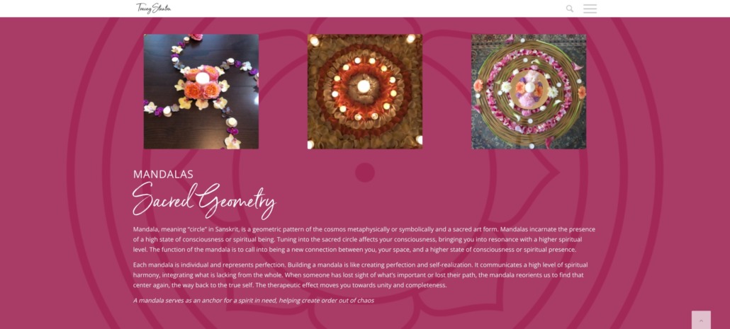
An informational section of the Space Clearing page on Tracey Stanton’s website. Good content and beauty combined.
Beauty with Purpose
It’s time to retire the myth that beauty is a liability.
Thoughtful design elevates usability. It fosters trust. It makes an impact. And when crafted with care, it can even momentarily lift the user into something greater.
Because when design functions beautifully, the experience doesn’t just work—it elevates.


 © Yohanna Jessup - Archetype & Hourglass