Daylight Computer’s website takes users on a journey using both vertical & horizontal scrolling that emphasizes their message of computers designed for well being.
Visual Storytelling: A Practical Guide
We get a lot of questions about visual storytelling—not the buzzword, but the real craft of it. How do you create design that feels like something, not just looks polished? How do you translate essence into form without over-explaining?
This article unpacks our approach, gathered from years of creating for artists, wellness brands, and vision-led founders who want their visuals to mean something
What Is Visual Storytelling?
Let’s start with what it’s not. It’s not just making things pretty. It’s not traditional storytelling with a beginning, middle, and end.
Visual storytelling is the art of creating a felt experience through design. It’s about shaping how something lands with a viewer—emotionally, energetically—often before they read a single word.
You’ve seen it when:
- A painting seems to slow your breath
- A website flows so intuitively it feels like it’s reading you
- A brand identity holds a founder’s values without saying them outright
When done well, it creates presence. It offers context. And it quietly says, “You’re in the right place.”

Source: Appleton Creative
The Five Core Principles
These aren’t rigid rules—more like invitations. Ways to ground your creative process in intention and clarity.
1. Essence First
What’s the core truth or energy you’re trying to express? Is it softness? Structure? Sacredness? Let that guide every decision. Everything else—layout, color, form—should be in service to that essence.
2. Hierarchy as a Guide
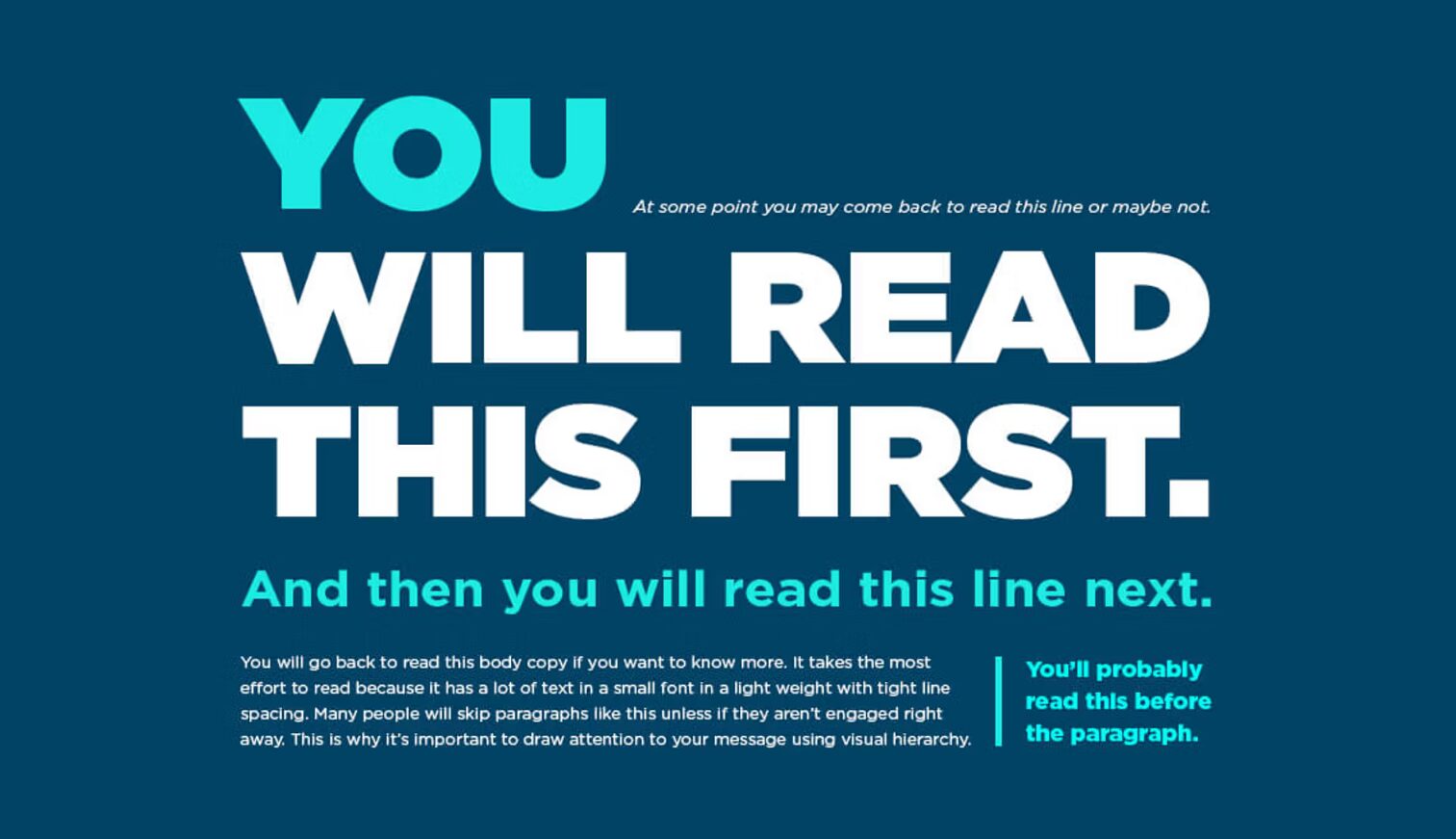
Good design gives people direction. Use contrast, size, spacing, and weight to show what matters. Let their eyes—and energy—move with purpose.
In web design, your headline isn’t just an intro. It’s an emotional cue. The call-to-action isn’t just a button. It’s a subtle nudge.
3. Geometry Matters
Symmetry, sacred shapes, and grid structure help stabilize perception. They’re not just aesthetic—they’re deeply human ways of orienting ourselves. Structuring design using geometric composition techniques has given artists and designers ways to think systematically about visual layout and create beautiful and balanced designs for hundreds of years. For those interested, here is A short history of geometric composition.
4. Color Sets the Tone
Color is atmosphere and evokes emotions. A soft blush can open space for tenderness; indigo might invite reflection. Choose deliberately. Think in temperature, not just hue.
5. Rhythm & Flow
Every visual journey has pacing. Whether it’s a painting or a product page, there’s a rhythm to how people move through it. Let them pause. Let them feel momentum. Avoid visual noise that forces too much at once.

Samantha Keen’s website takes users on an intuitive journey while highlighting her book.
Visual Storytelling in the Digital Space
In our studio, we think of websites not as static pages, but as experiential landscapes.
Designing a homepage? Think less “What do I need to show?” and more:
- What do I want them to feel here?
- Where do they need clarity?
- Where can we offer breath, or a shift in energy?
When every design choice serves that flow—from font scale to section breaks—you’re not just sharing information. You’re shaping experience.

Creator at work!
The Role of the Creator
Whether you’re designing, painting, or building a brand, your state while creating matters. Presence shows up in the work. So does rush. So does clarity.
Some tools we return to:
- Cross-based compositions for grounding
- Gradients to suggest transition or uplift
- Gold leaf as a focal point of sacred attention
- Geometric scaffolding to anchor the abstract
We use them not as trends, but as meaning-carriers—visual cues that hold more than what meets the eye.

Source: Gaborkovax
Common Pitfalls to Watch For
These show up often—especially when people are trying to do too much at once:
- Too many ideas. If everything’s important, nothing lands.
- No visual hierarchy. Without clear structure, viewers work too hard.
- Trend-chasing. Aesthetic without depth doesn’t stick. It scrolls by and disappears.
If we had one golden rule? Let it breathe. Trust that simplicity, done with care, is powerful.
Final Thoughts: Meaning as the Medium
Visual storytelling is quiet work. It doesn’t shout, but it does stay with people.
It can move someone from scattered to settled. From browsing to belonging. From curious to connected.
And that’s the heart of it. You’re not just designing. You’re creating an experience that helps people feel what you’re here to offer.
Want to see this approach in action?
Take a look at our case studies: White Rose and Crane Rock —two projects where visual storytelling became the thread that tied everything together.


