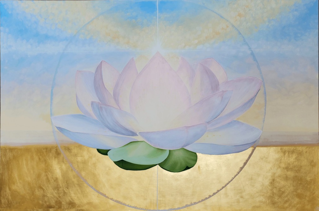
“Lotus – The Return” A 6 x 4 ft painting commissioned as an anchor piece for a Functional Medicine clinic in NYC.

“Lotus – The Return” A 6 x 4 ft painting commissioned as an anchor piece for a Functional Medicine clinic in NYC.
Art specification in wellness environments is one of the most consequential — and most under-considered — design decisions on a project. It comes late in the process, often after the spatial decisions have been made, the palette has been settled, and the client relationship is already established. It is frequently treated as a finishing layer rather than a structural one.
This guide argues for a different approach: that in spaces designed for healing, reflection, and therapeutic practice, the art is part of the architecture of the experience — and deserves to be treated with the same intentionality as the light, the material palette, and the spatial proportion.
What follows is a practical framework for designers working with wellness clients: how to think about art specification in this context, what questions to ask, how to approach scale and placement, and how to distinguish between art that will genuinely serve the space and art that will simply occupy it.
The most important shift in specifying art for a wellness environment happens before any artwork is selected. It is a reframe of what art is being asked to do.
In most residential or commercial interiors, art is specified to complement — to complete the visual composition of a space, to add warmth or interest, to reflect the client’s taste. This is legitimate. But in a wellness environment, art has an additional function: it is part of the patient or client experience. It affects how people feel when they walk in, how they settle (or don’t) during a session, what quality of atmosphere they carry with them when they leave.
When you brief a wellness art project around “what will complete this space visually,” you get different artwork than when you brief it around “what does this space need to hold for the people who will be in it?” Both are design questions. But the second one leads to significantly better outcomes in healing environments.
Some reframing questions worth asking your client at the outset:
The answers to these questions become your art brief. They are more useful than colour matching, style preferences, or general aesthetic direction.
In wellness environments, art is almost always specified too small.
This is understandable. Budget constraints are real. A large original painting is a significant investment. And designers — understandably cautious about dominating a space — tend toward restraint.
But in a healing environment, a single artwork of genuine scale changes the room in a way that four smaller works cannot replicate. Scale is what allows art to anchor a space rather than simply inhabit it. It is what gives the eye somewhere to land and return to — which is, as the research on neuroaesthetics consistently shows, one of the primary ways visual environments support nervous system regulation.
A practical test: stand in the room and imagine where a patient or practitioner’s eye will naturally go when they look up from what they are doing. That is where the artwork needs to be, and it needs to be large enough to genuinely occupy that field of view rather than flicker at the edge of attention.
For large-scale commissions in wellness environments, some useful reference points:
Scale also affects how the art is commissioned or sourced. At 40 × 30 inches, a high-quality limited edition print with depth and material presence may serve the space well. At 6 ft × 4 ft and above, an original commission is almost always the stronger choice — both for the visual and material quality of the work, and for the relationship it creates between the artwork and the specific environment.
Placement decisions in wellness environments should be driven by sightlines, not by available wall space.
The most powerful placement in most wellness spaces is the wall that faces the primary point of rest or attention — the wall a patient faces during a session, the wall visible from the reception desk, the wall at the end of a corridor. This is where the anchoring work should live.
Secondary placements — works that are seen peripherally, in transition, or from multiple angles — serve a different function: atmosphere rather than anchoring. They can be smaller, more numerous, and more varied in tone.
A few placement principles that consistently produce better outcomes in wellness environments:
Eye level is a starting point, not a rule. In a space where people will be seated or lying down for extended periods, the artwork’s center may need to be lower than standard gallery hang height. The relevant sightline is the one from the position of the patient or client, not the standing visitor.
Distance affects impact differently than in residential contexts. In a room where someone will spend thirty to sixty minutes in a fixed position, the relationship between their distance from the work and its scale is critical. A painting that reads well from across a large gallery may feel insufficient from twelve feet away for forty-five minutes. Test placement decisions against the actual session distance, not the entry distance.
Breathing room is essential. In wellness environments, visual clutter is antithetical to the purpose of the space. A single work with generous space around it will consistently outperform a cluster of works, regardless of the individual quality of the pieces. Give art room to hold its own atmosphere.
Consider how light changes throughout the day. Natural light that makes a work luminous at 10am may flatten it or create glare at 3pm. Works with gold leaf or other reflective surfaces are particularly sensitive to light direction and quality — and can be extraordinarily responsive to changing light when placed well, or deadened by poor placement.
The question of originals versus prints comes up on almost every wellness art project, and it is worth having a clear framework for advising clients.
The research on this is more nuanced than the art market’s usual position (“originals are inherently superior”) suggests. A high-quality, limited edition print from an artist whose work genuinely suits the space will consistently outperform a mediocre original. Quality of the work matters more than medium category.
That said, in spaces where the artwork will be encountered daily by practitioners and repeatedly by patients over years, there are real reasons to consider originals or hand-embellished editions where budget allows:
Depth of engagement over time. Original works — particularly those with textural surface, visible process, or material complexity — continue to offer something on repeated encounter. They are less likely to become invisible. This matters enormously in a therapy room where the same painting is seen hundreds of times.
Material presence. The difference between a print and an original is partly about quality of reproduction, but it is also about the presence of the object itself. A painting with physical depth, brushwork, and material surface engages the viewer differently than a flat printed surface — in ways that several neuroaesthetics studies have begun to quantify and that practitioners frequently describe without being able to name.
The relationship argument. For organisations with a strong sense of community and identity, a commissioned original work carries a different kind of weight in the space. It was made for this room, for this community, by an artist who understood the purpose. That provenance matters to the people who inhabit the space — as the Peace Rose commission for a Berkeley meditation center demonstrated clearly, where the painting’s creation process itself became part of the community’s story.
For clients where budget genuinely constrains the original option, a clear hierarchy helps: invest in originals or hand-embellished editions for the primary anchoring positions, and use high-quality limited edition prints for secondary placements and transitional spaces.
The practical difference between commissioning an artist and sourcing from an art vendor or catalogue is greater in wellness environments than in most other contexts — because the site-specificity of the brief matters more.
An art catalogue can provide a painting of a lotus. An artist who understands what the space is for, who has sat with the practitioner and heard what the room needs to hold, who has oriented their creative process toward that specific environment and that specific community — that artist produces something different. Not necessarily technically superior, but more genuinely fit for purpose.
The commission process for wellness environments typically involves:
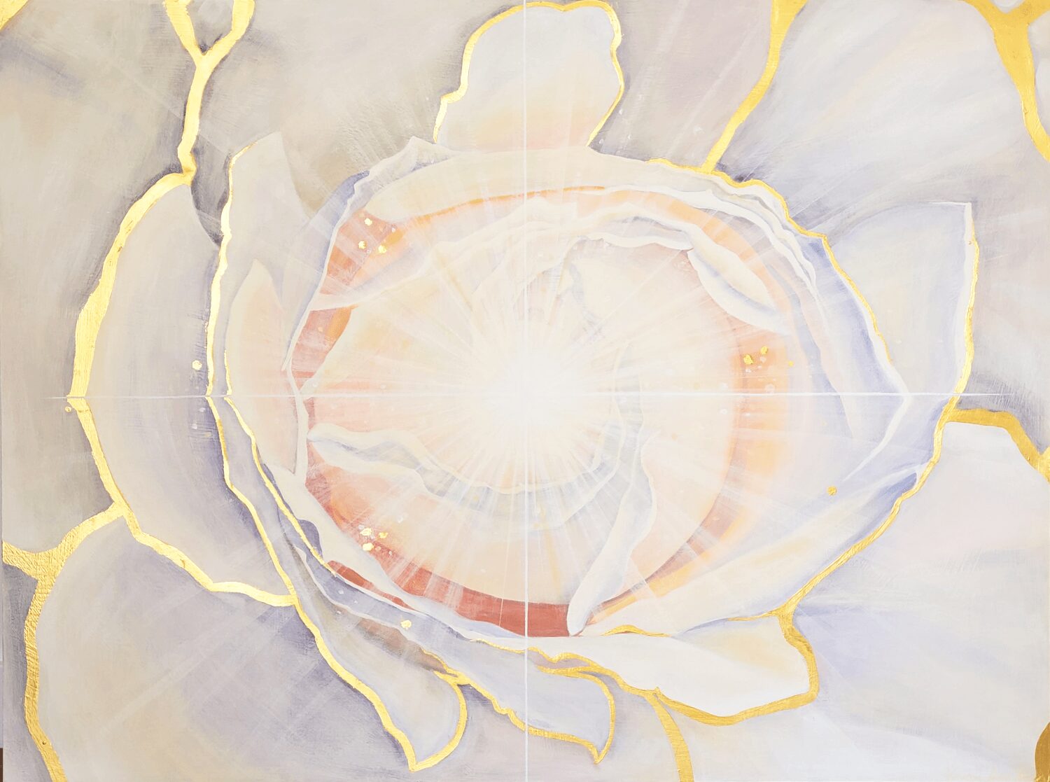
“Open Spirit Rose” A 40 x 30 inch painting commissioned as an painting to help patients transition into treatment at a Functional Medicine clinic in NYC.
This process takes longer and costs more than sourcing from a catalogue. It is worth it for the primary anchoring positions in any significant wellness environment. The Peace Rose at a Berkeley meditation center, “Lotus: the Return” at a Manhattan functional medicine clinic, “Open Spirit Rose” in the same clinic’s entry foyer — these were not decorative choices. They were site-specific works developed through genuine creative dialogue between artist and practitioner. The difference in the spaces is measurable, and the clients confirm it.
For designers, the commission process also creates an opportunity to add real value for the client — as the design professional who understood the brief deeply enough to connect a practitioner with an artist whose work could genuinely serve the space. That is a different kind of value than selecting from a catalogue, and clients remember it.
This is the element of art specification for wellness environments that designers are most likely to underweight — and that matters more than most expect.
In spaces where people come in states of vulnerability, transition, or healing, the symbolic language of the art on the walls is not neutral. A work featuring imagery of dissolution, disruption, or open-ended abstraction can be genuinely uncomfortable for a patient in a fragile state. A work featuring imagery of unfolding, emergence, return, groundedness, or luminous expansion tends to serve these environments better — not because it is more aesthetically conservative, but because it speaks to the experience of the people in the room.
This does not require literal or illustrative imagery. Abstract work can carry any of these qualities. The question is what the work is oriented toward — what quality of inner experience it is addressed to — rather than what it depicts.
Botanical forms, radial compositions, landscapes with strong horizontal elements, works with gold or luminous surface qualities, works with a clear center of gravity — these recur in successful wellness art placements for reasons that are both aesthetic and, as the research increasingly suggests, physiological. They speak to the visual system and the nervous system simultaneously.
When briefing a wellness commission or evaluating art for a wellness environment, the symbolic dimension is worth a specific conversation with the client. Not a long one. Sometimes a single question is sufficient: “When someone who has just had a difficult session looks up at this wall, what do you want them to see?”
The answer tells you everything about what the art needs to do.
Archetype & Hourglass works with interior designers and art consultants on site-specific commissions and print placements for wellness environments, retreat centers, integrative health practices, and spaces designed for healing and inner attention.
